The project in question was created for a university project with other classmates. The purpose was to apply the UX design process to develop an idea in the form of an application.
Introduction
In this phase, we attempted to analyze the problem of organizing one's suitcase. When embarking on a trip, deciding what to include or not in one's luggage can be a stressful activity. Understanding what to bring and what not to bring also depends heavily on the destination, weather forecasts, and personal characteristics.
Therefore, the goal was to create an application that could help organize the suitcase, taking into account personal characteristics, weather, and the destination of the trip.

Needfinding
Through a search of ISTAT data, we attempted to understand the target users, their travel habits, and their average age. In doing so, we identified our target audience.
then conducted a semi-structured interview with 6 people in our target audience. We prepared a series of questions and presented them to the participants, obtaining both objective and subjective qualitative data, particularly related to their behaviors, issues, and needs.
Generating ideas
After conducting the needfinding, personas were created based on the identified target audience:
- Francesca: Teacher (52 years old)
- Fabrizio: Marketing Manager (47 years old)
- Ambra: Freelancer (40 years old)
Finally, the first ideas that the solution will implement were brainstormed:
- Welcome information
- Travel profile
- Travel information
- Luggage organization
- Weather and climate information for the chosen destination
- Travel tips
All of these ideas were evaluated and implemented within the application.
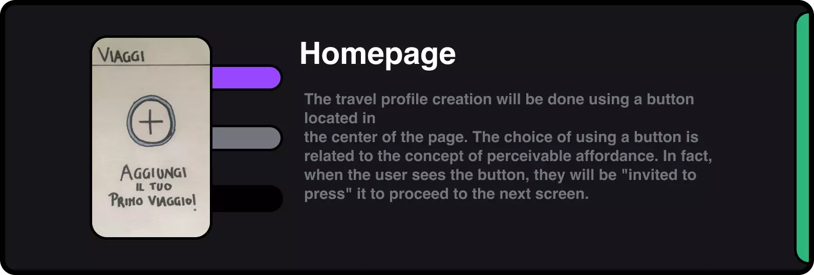
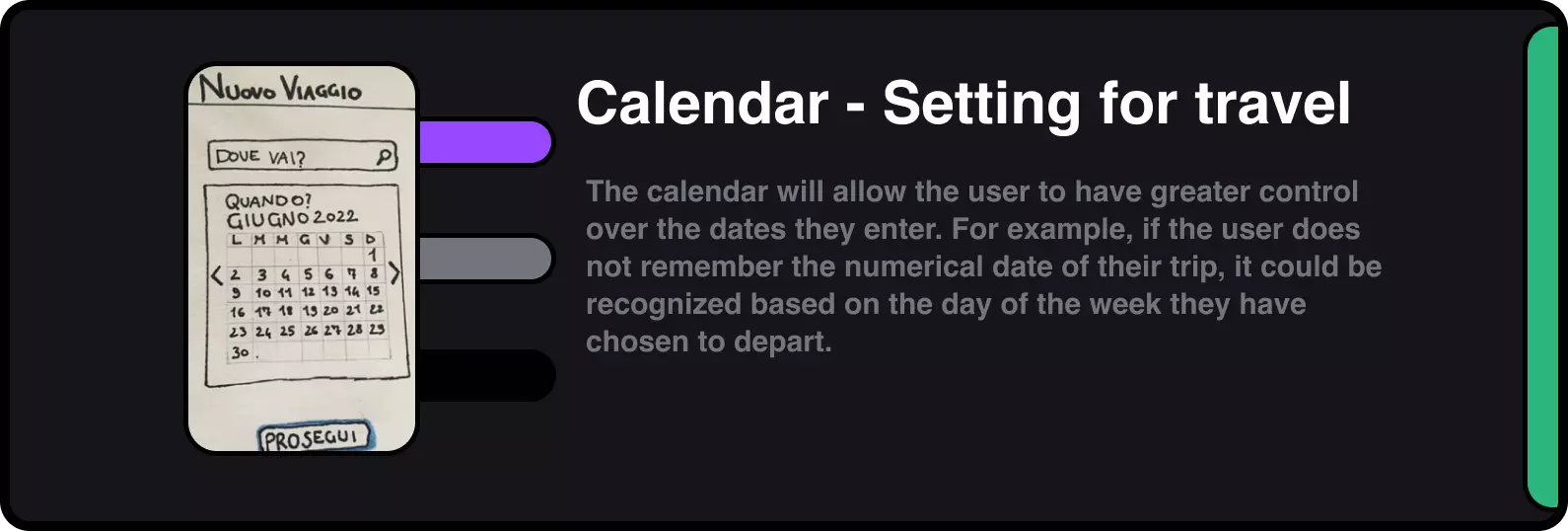
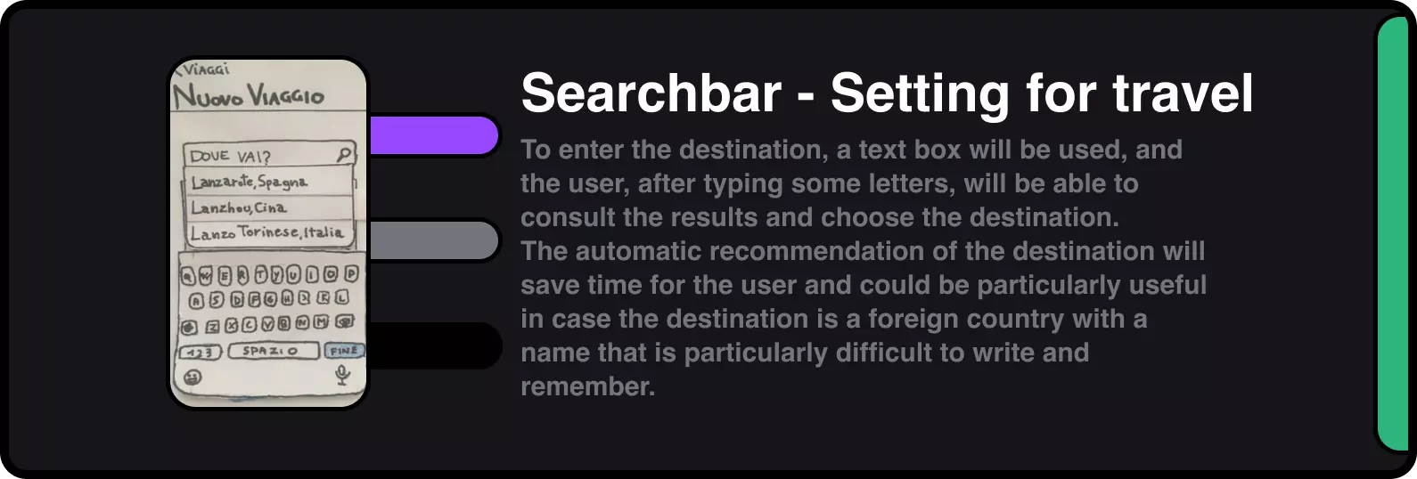
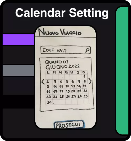
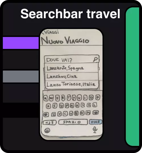
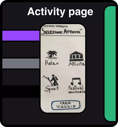
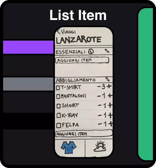
Prototype
Prototype
Task analysis
In order to understand if the ideas present in the prototype are correct from a usability standpoint, 4 tasks were created that will lead the user to perform the main functions present in the application. A usability test conducted on 5 people allows for a good number of usability problems to be found, almost as many as would be found using many more participants. Each task seeks to explore a fundamental aspect of the functions that have been implemented within the prototype.
Prototype video
Redesign - Travel page
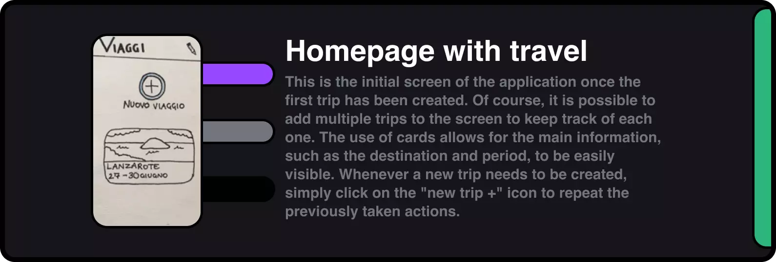
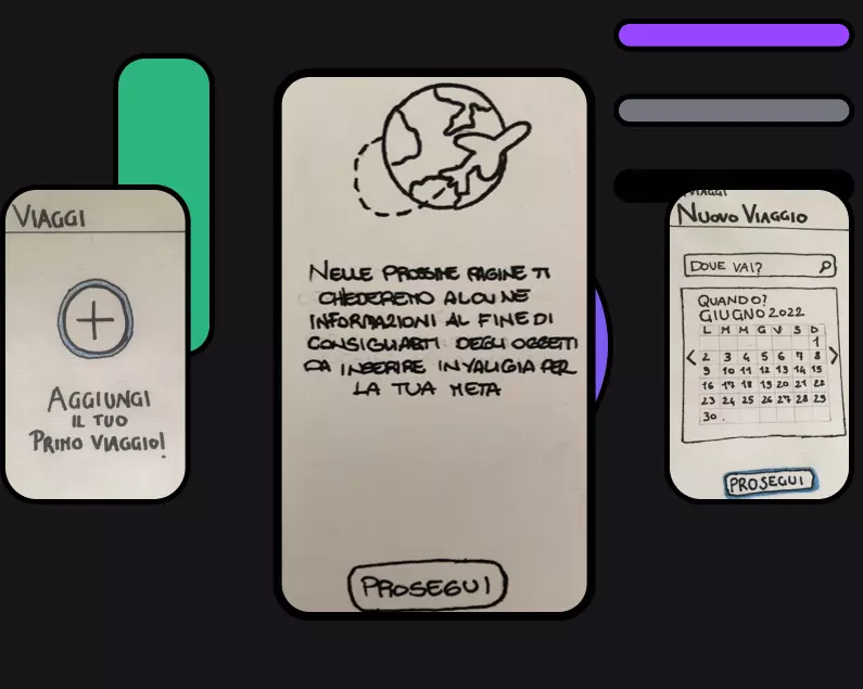
Some users did not realize that the information (activities to be done on vacation) we asked for in the travel profile creation was a prerequisite for creating their suitcase, and that it was needed to recommend specific items to pack based on the activities planned.
For this reason, we have decided to add a new page located between the main trip screen and the destination input screen. On this new page, we will explain to the user the reasons why we are asking for some preliminary information.

Redesign - Essentials
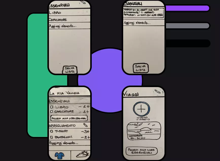
As seen previously, some users did not understand the function of the essential category. The function of the latter was explained through a banner that opened by clicking on the informational icon ("i") next to the label of the category in question. It was often ignored or read quickly. Additionally, the essential category, being already present within a trip, was associated with the trip itself and not with a list of common things for all trips.
We have therefore decided to move this category right after the introduction of the application, before the creation of trips, to a dedicated page. On this page, the function of the category will be explained, and it will be possible to start inserting recurring items for all trips. It will then always be possible to access the essential list on the page containing all trips to make changes to it.
Then, for each trip, on the baggage page, the essential category will be presented with the previously inserted objects, with the possibility of checking them off to include them in the baggage and manage their quantity. From this page, it will still be possible to access the essential page in case there is a need to make other modifications.

Redesign - Items page
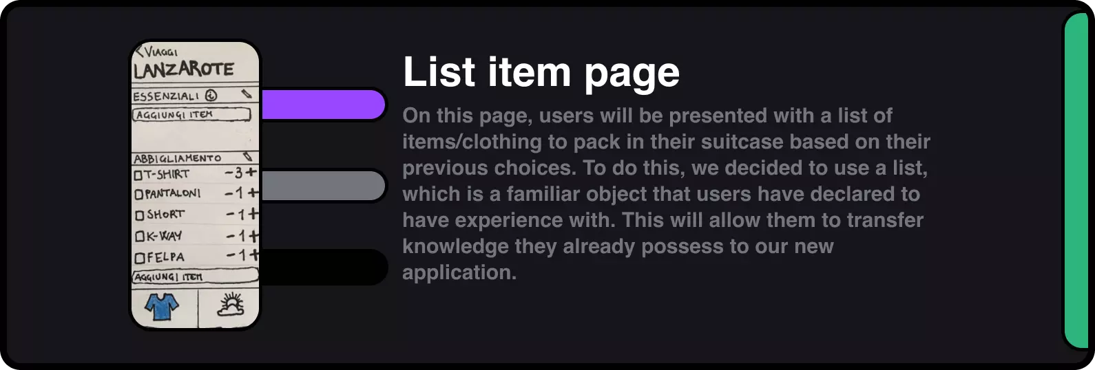
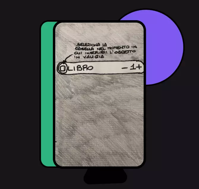
When asked to increase the quantity of an item in the clothing category, they checked the item before pressing the + button, performing an unnecessary step. This created a problem of discoverability. They did not understand the function of the checklist, in fact, they thought that the checklist was functional for modification when it is actually functional for inserting items into the baggage.
To overcome this problem, we have decided to leave the page unchanged, but when the user accesses the page related to the organization of the baggage, a banner highlighting its function will be displayed.
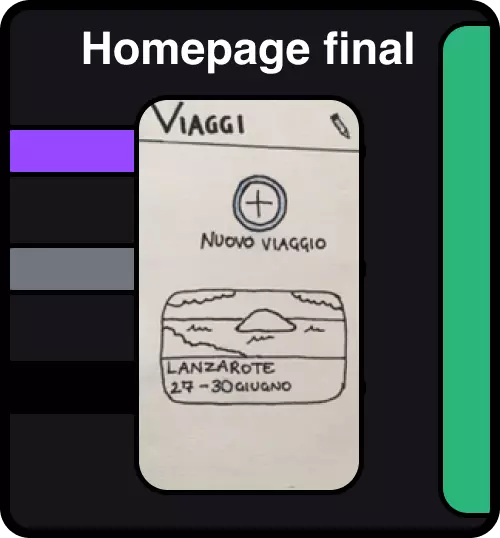
Furthermore, to help the user understand that the items on the list are actually the ones to be inserted into the baggage, we have changed the wording of the page from "Lanzarote" to "My Baggage".

Conclusion
This project allowed us to understand the potential of the User Centered Design process. We were initially able to identify the needs of users related to a specific topic and subsequently think of a solution that addressed these needs.
The creation of a low-fidelity prototype then allowed us to intercept various errors and misunderstandings related to the solution we had designed, in a preliminary phase of the process. In this way, with limited use of resources, we corrected and redesigned some critical elements that would have otherwise emerged later. Finding these errors in more advanced stages of application development would have greatly increased the amount of work required to make all the necessary changes.
During the process, we also realized the limits of performing a single UX design cycle: to be truly effective, it should be repeated several times, to detect further problems not intercepted in this cycle and refine the product even more.

