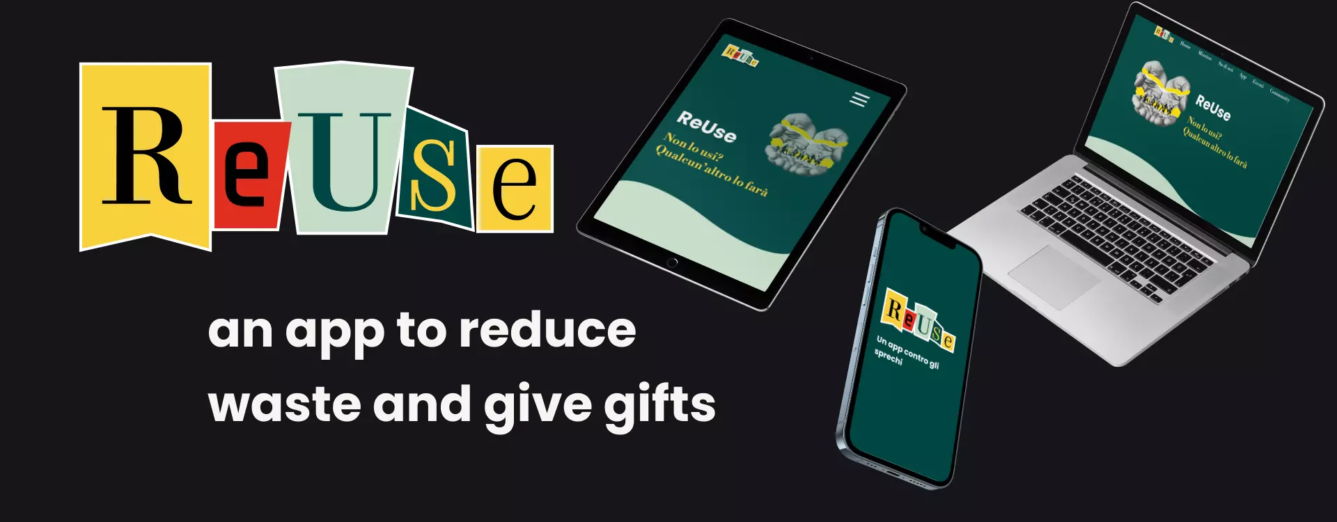
Introduction
The aim was to inspire ourselves with one of the goals of the Sustainable Development Agenda 2030, specifically we were inspired by goal number 12. The app aims to create a platform for donating and receiving second-hand items between individuals, and for companies to give away unsold items, promoting recycling and fighting waste.
ReUse was born like that!
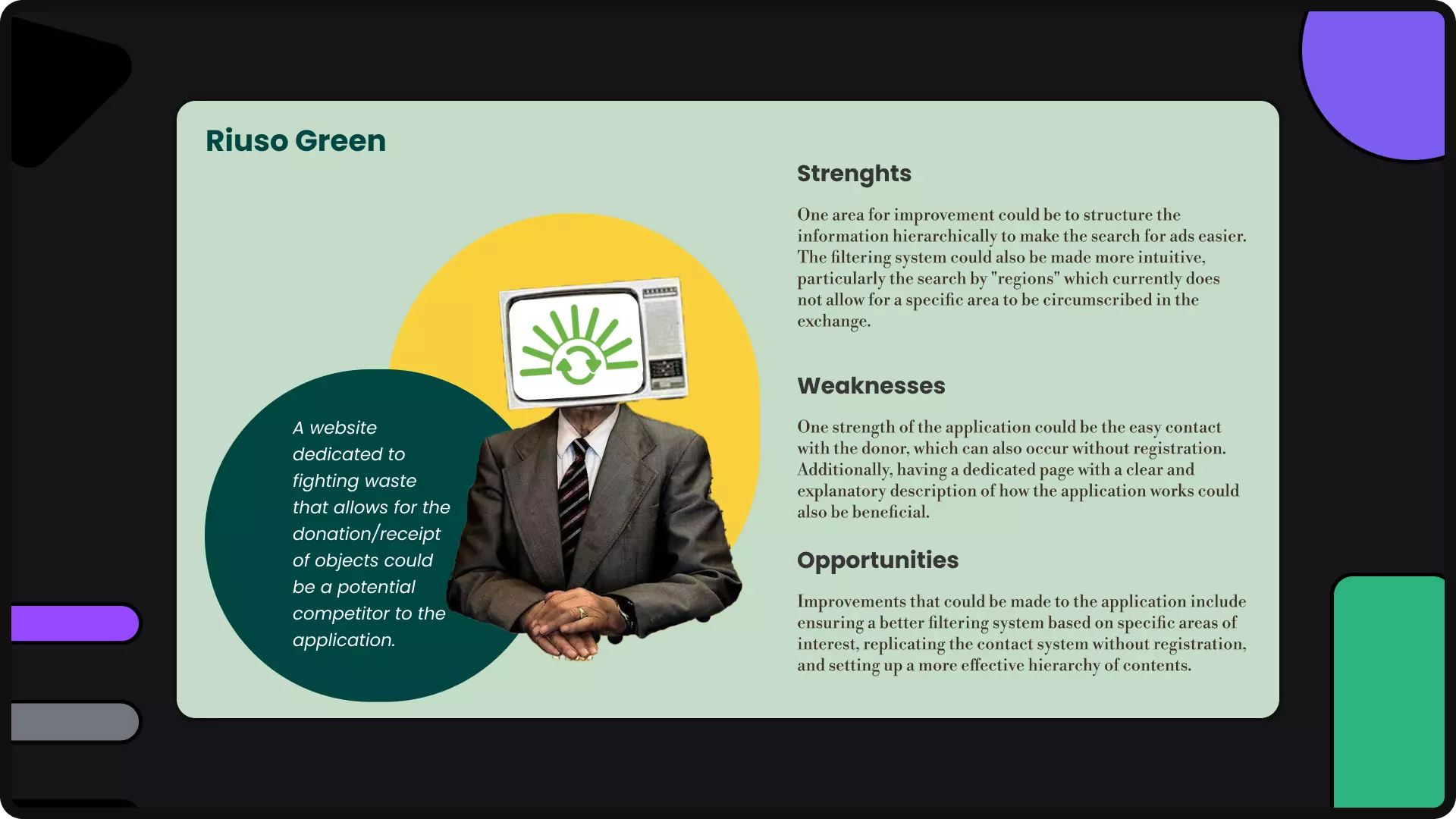
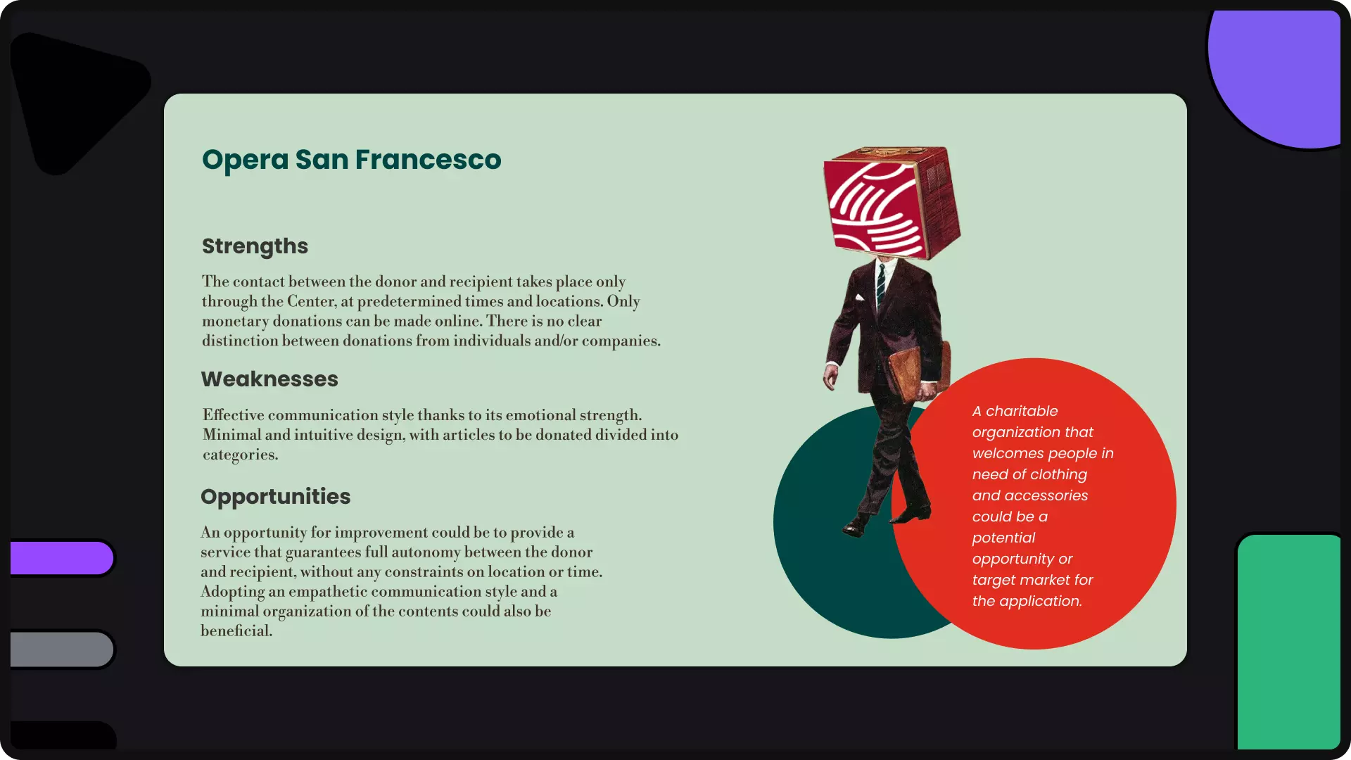
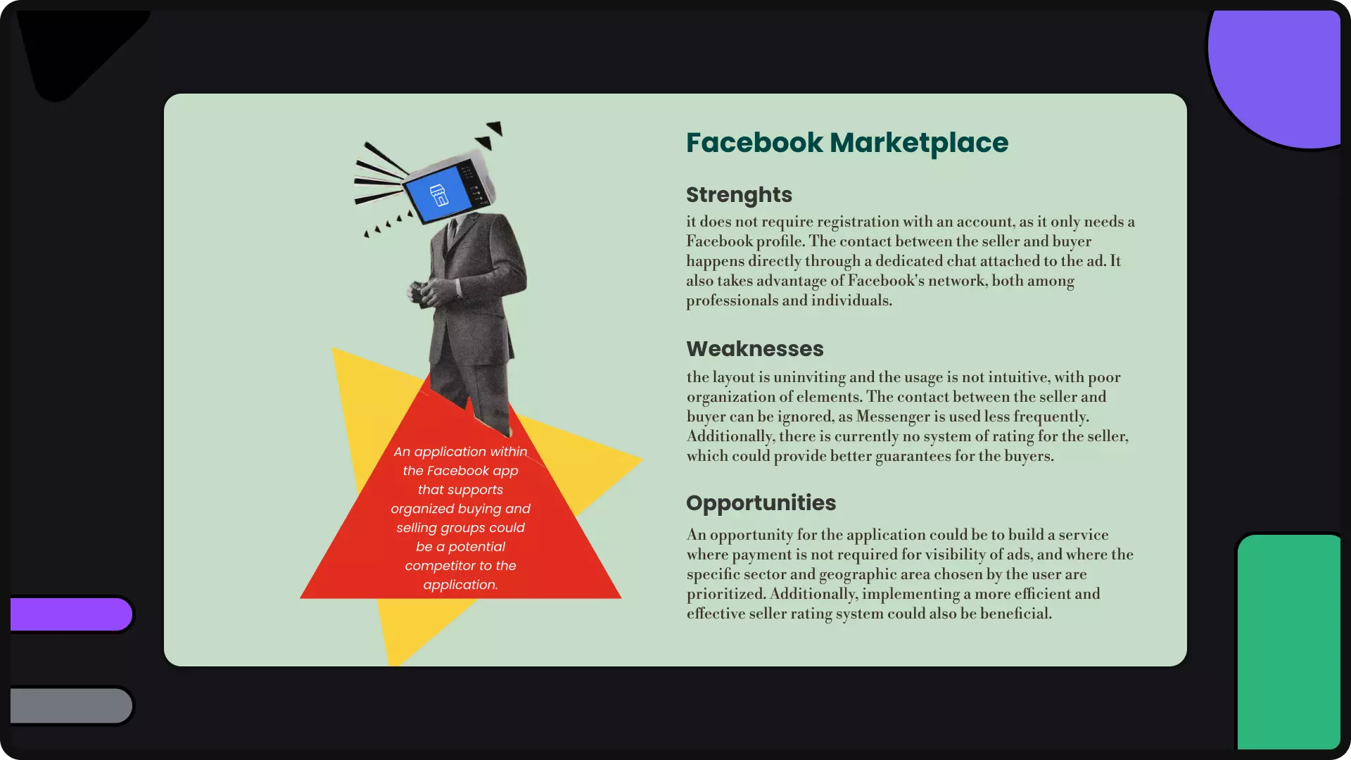
Competitor Analysis
In this phase, we are analyzing and trying to understand where our application will fit in the market by analyzing the possible competitors and for each of them, their strengths, weaknesses, and opportunities.
Target
Through consulting ISTAT data and other online sources, we have been able to draw up a series of target profiles, namely potential customers who would use our application to give and receive second-hand items. Specifically, we have seen that those who use second-hand items of various kinds are:"
- 66% graduates
- 65% are part of the so-called Generation Z
- 63% are made up of families with young children.
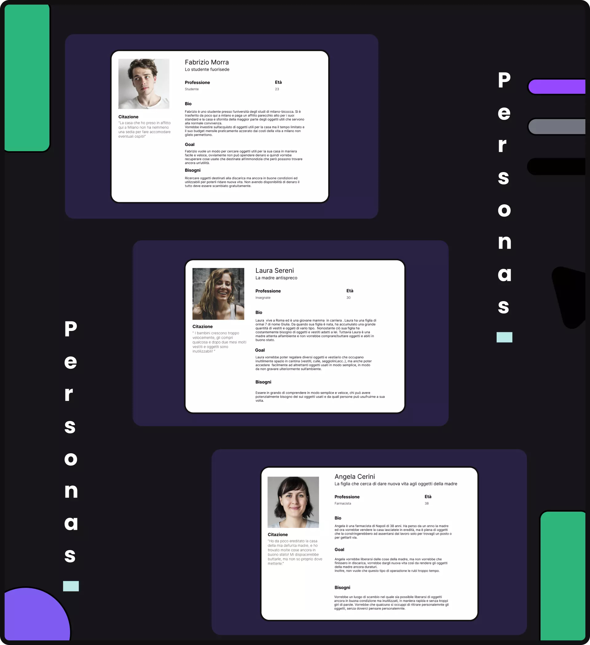
Personas
From the analysis of the target, we have identified 3 potential early users who could become our future customers. Through personas, we have systematized the target, giving them a name, a face, needs, and thoughts.
Concept
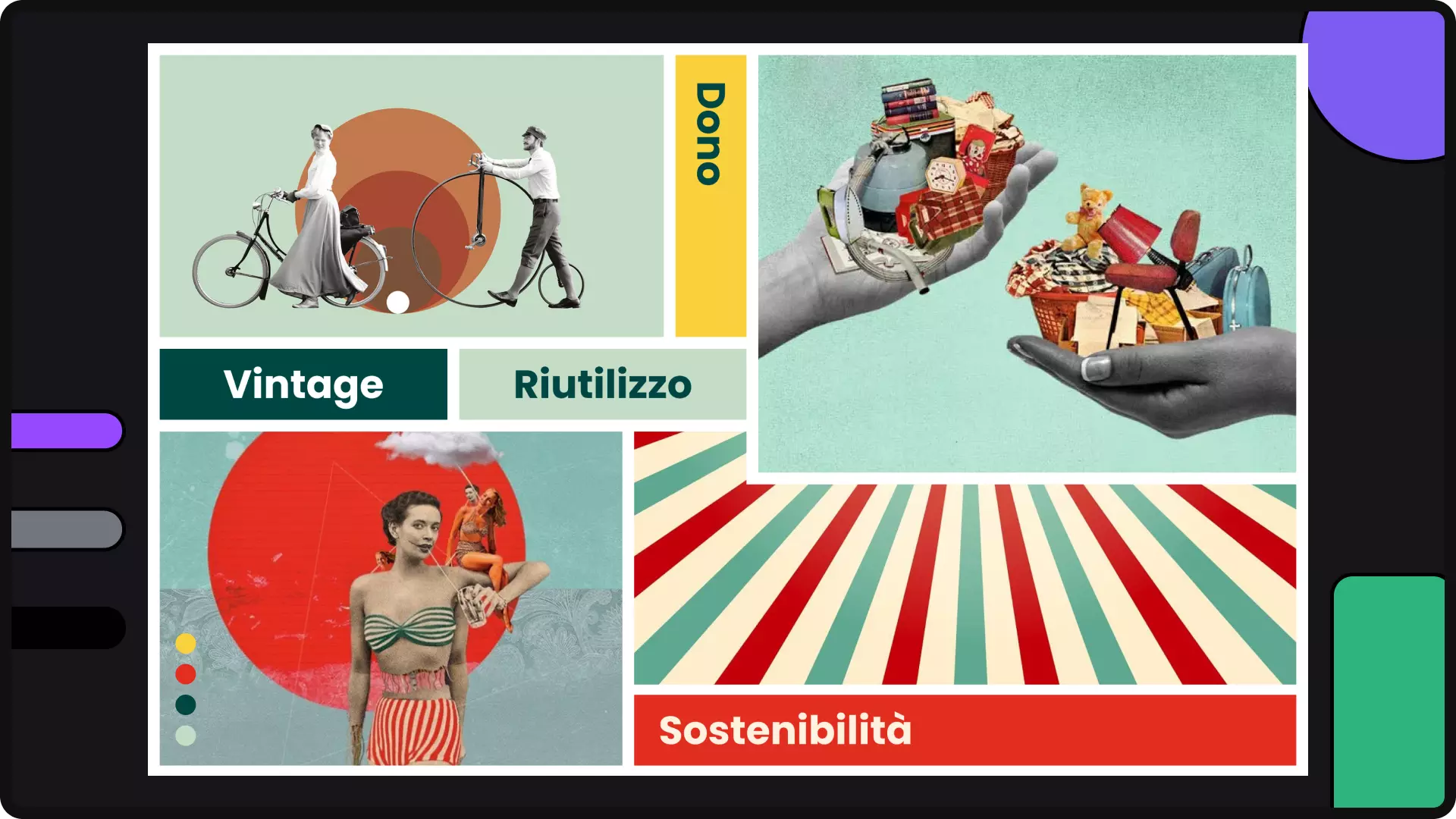
The main idea is to give new life to old things, to recolor forgotten objects or those we no longer use. The visual identity seeks to contrast the world of vintage with the bright colors of modernity. It fits into a broader idea of contemporary circular economy, dictated by the principles of environmental sustainability, reuse, and a predisposition to giving.
Moodboard
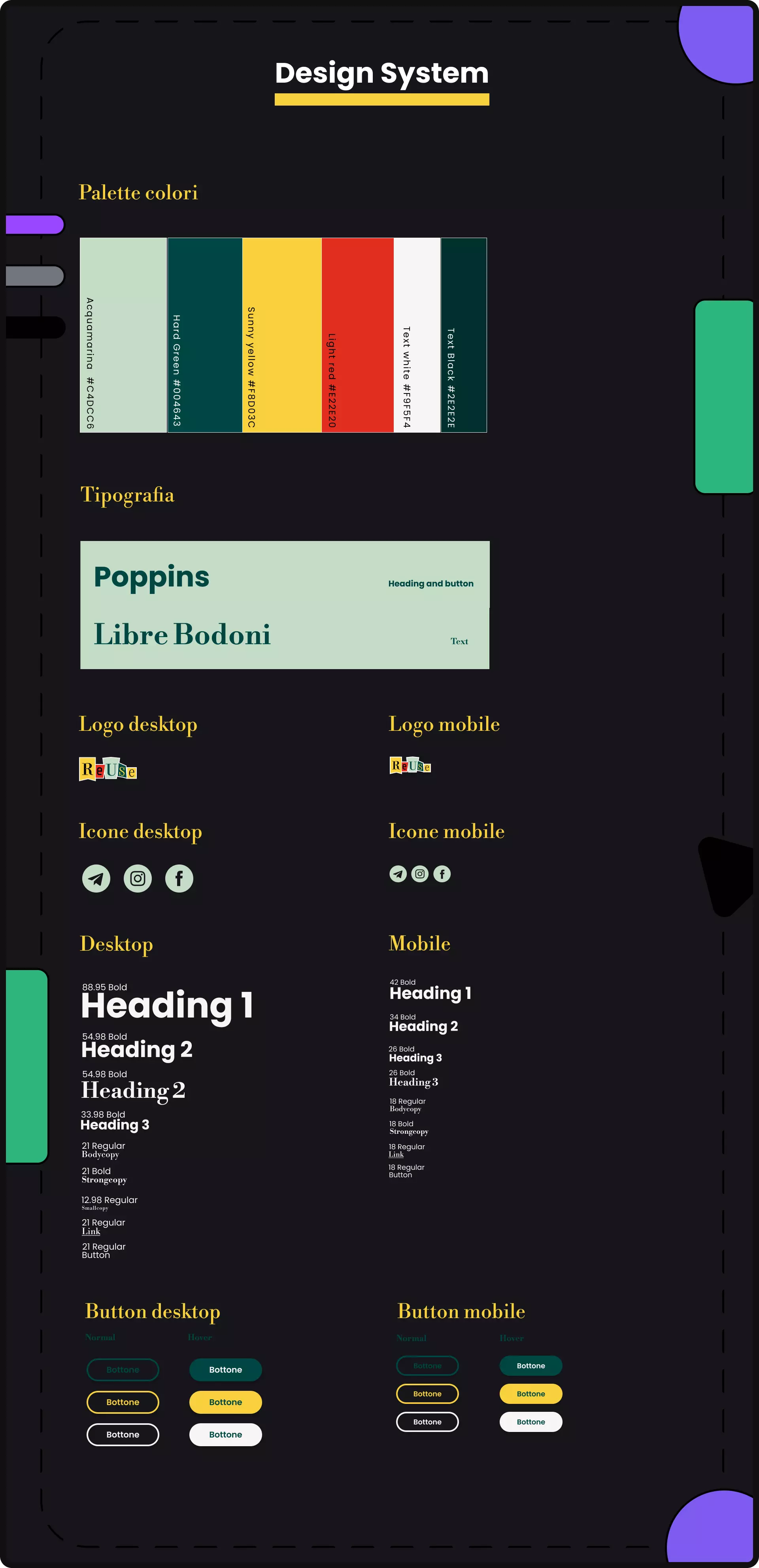
Design system
The choice of fonts, once included in the final moodboard, has never changed. In particular, the choice fell on two different fonts, so that one could be used for titles and the other for text.
Poppins was chosen for titles and buttons because, being a sans-serif font, it is perfect for giving prominence and modernity to the text. Additionally, it allows for the creation of hierarchy, emphasis, and rhythm.
Libre Bodoni was chosen for text because it conveys the elegance and delicacy of the content. We also used it to give the vintage idea of a font from "other times."
In the first wireframes, the font sizes were different from the current ones. These were created using the Golden Ratio, with a starting value of 18 px for desktop devices. Later, we realized that the texts were too small and the headings were not particularly effective.
For this reason, the current font sizes have been increased, still using the Golden Ratio, but this time setting the starting value at 21px for desktop. For mobile, we started from 18px and gradually added 8px.
Just like for the fonts, even for the color palette it was love at first sight. In fact, after including it in the moodboard, it was not changed anymore. We were inspired by a palette from Happyhues, slightly modifying it to better reflect our tone of voice and concept.
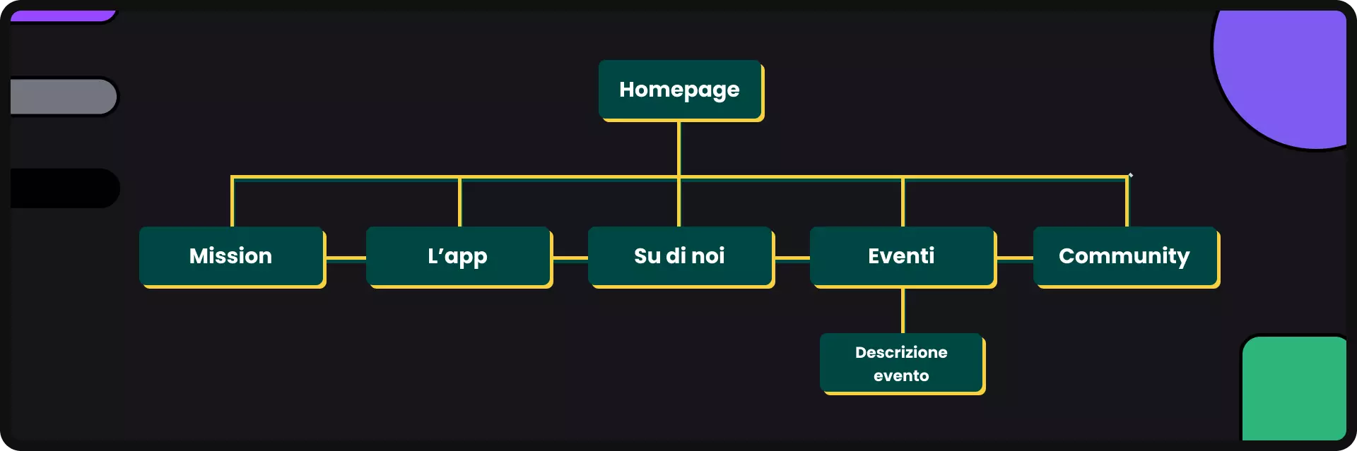
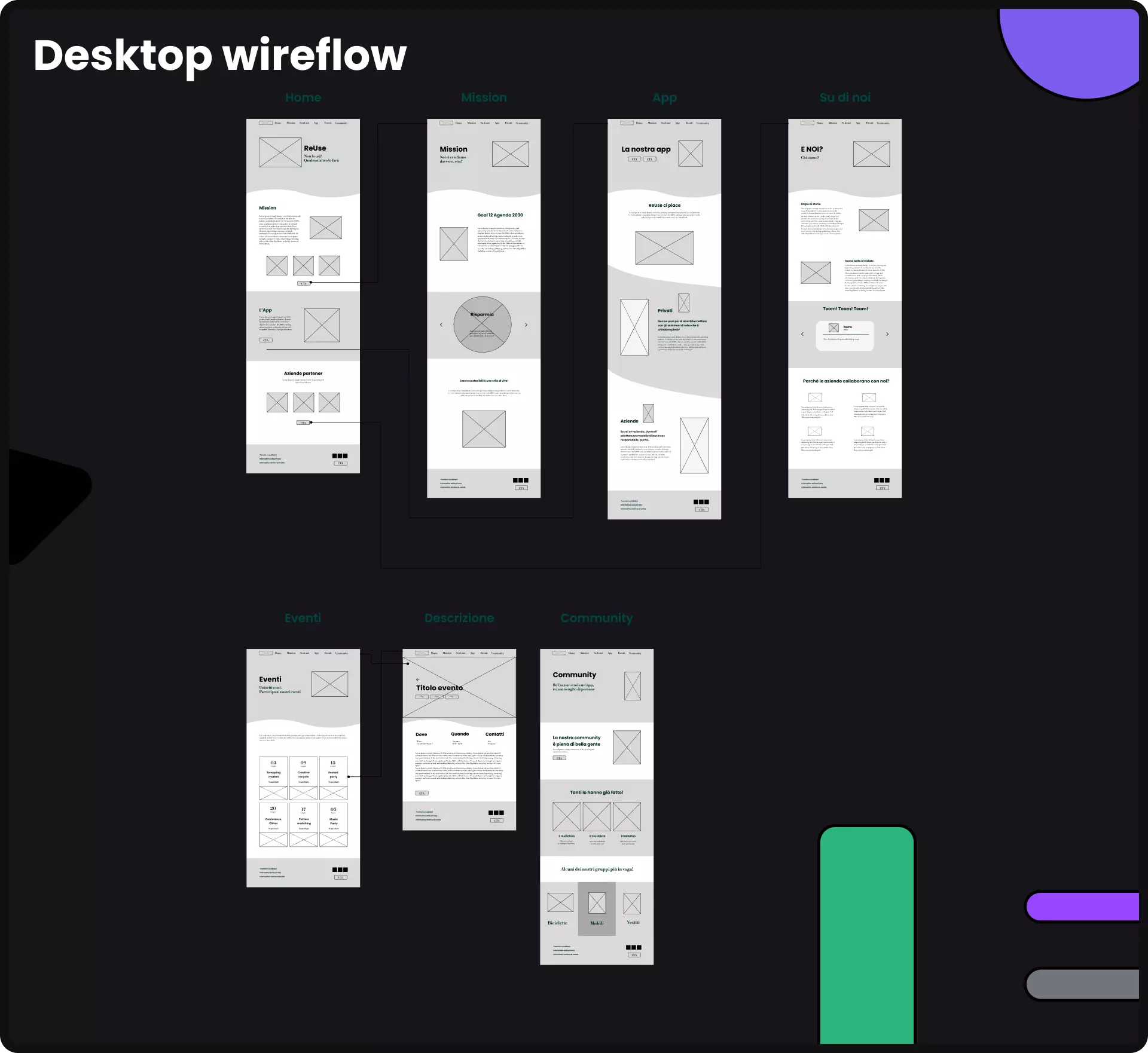
Information Architecture
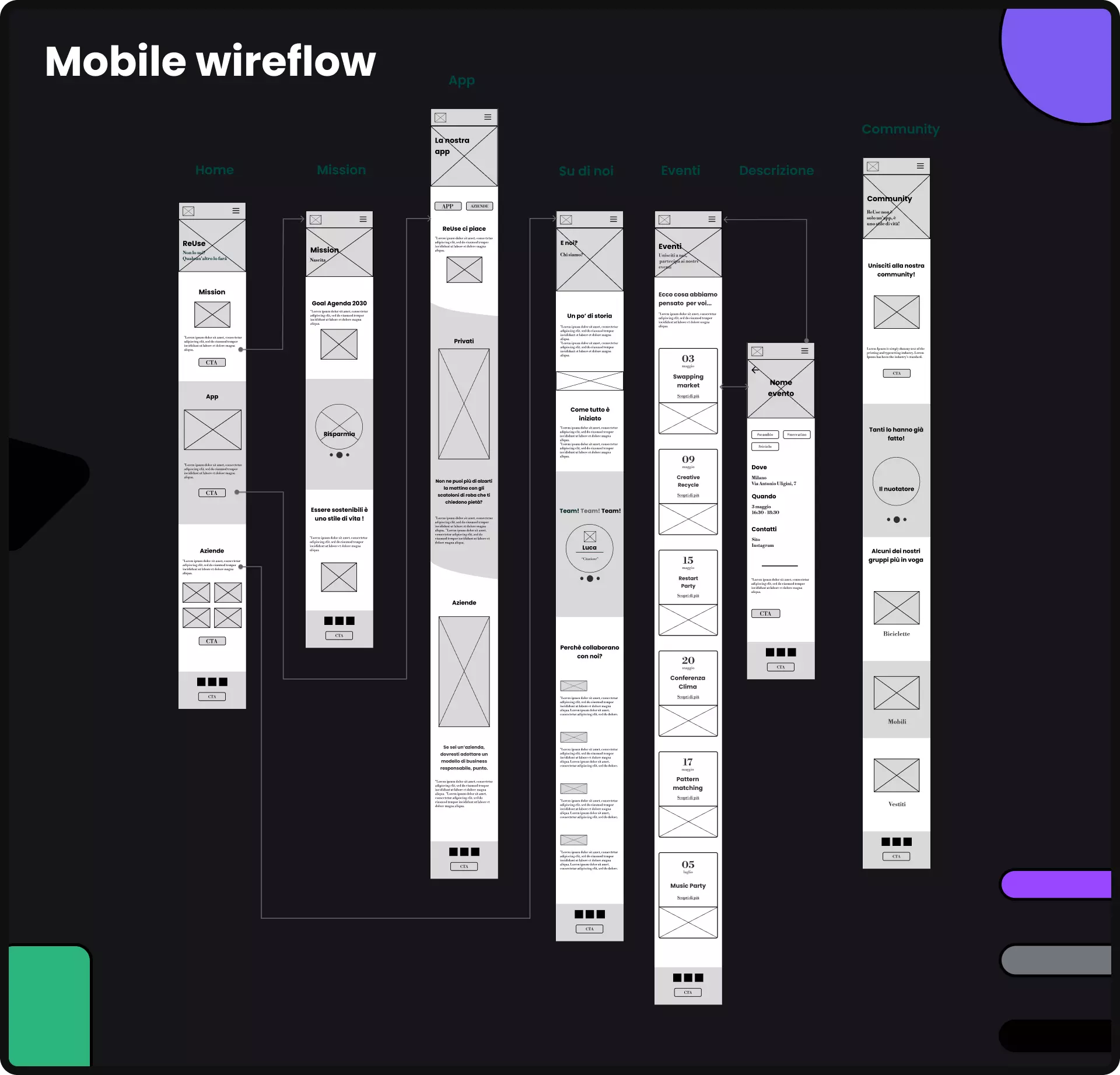
Wireflows
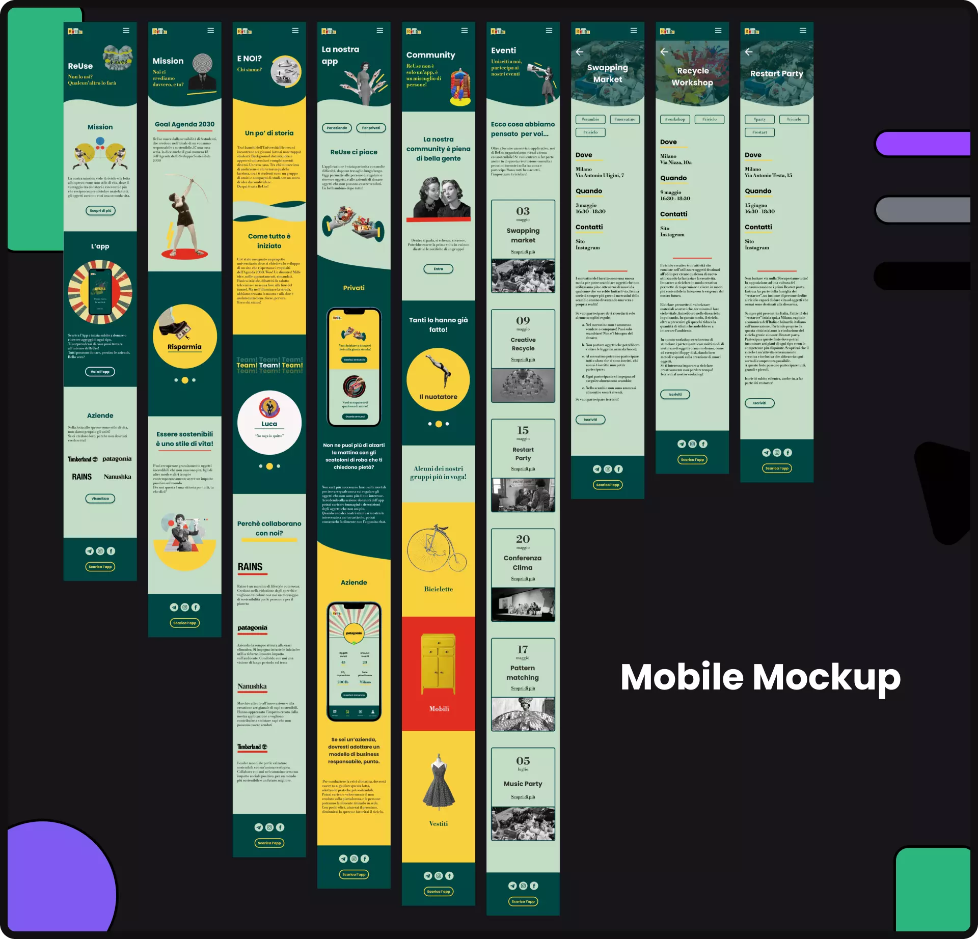
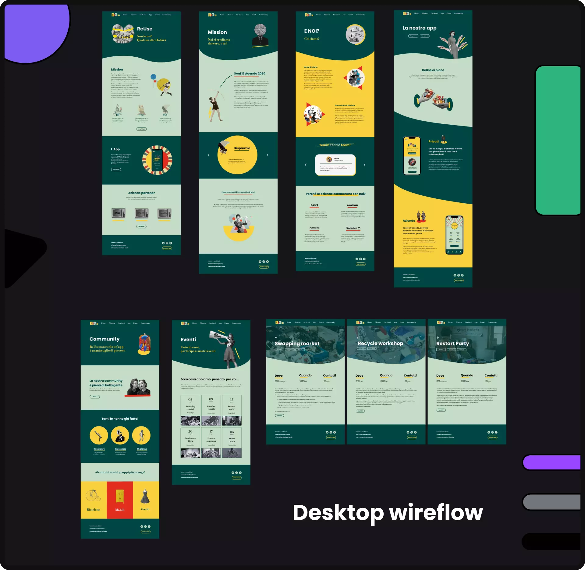
Highe fidelity prototype
In this last phase, we brought the wireframe to life by using the created design system. We tried to keep the design fairly minimal so as to ensure a successful development phase as well.
Web Developement
Finally, through the use of HTML, CSS, and Bootstrap, we developed our web application. The use of Bootstrap and its grids allowed us to have a responsive application and develop it in a simple and fast way. Additionally, through the use of Figma, we were able to export and manage all the images we had created for the web application mockup."
If you are interested in seeing the final product, please contact me.